
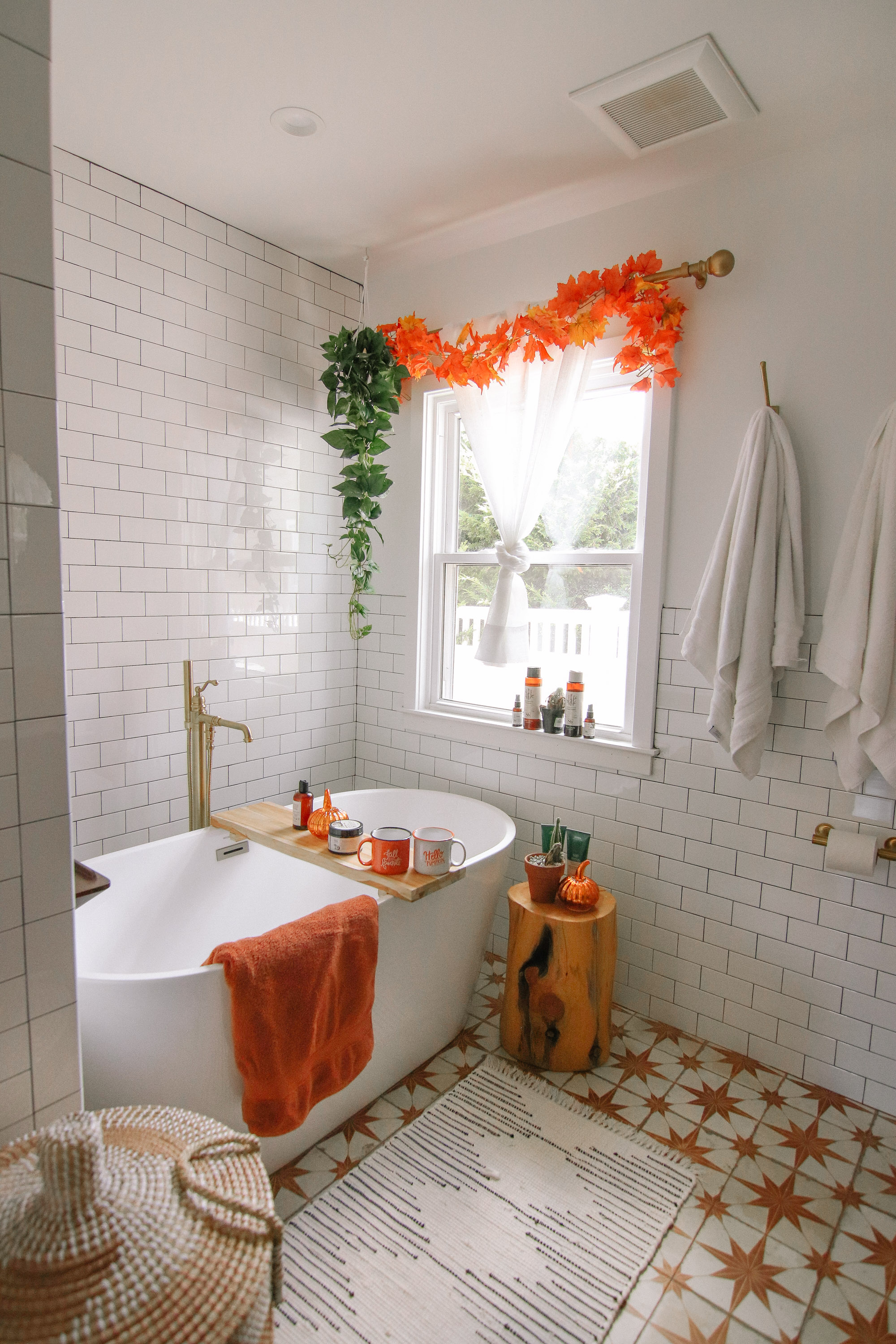
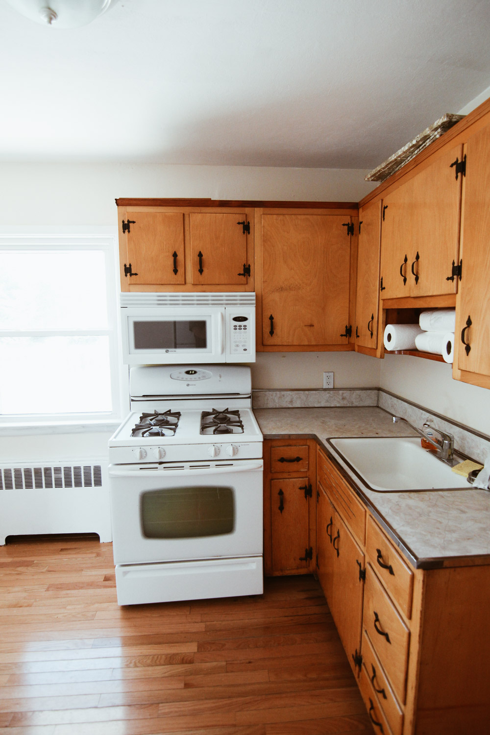
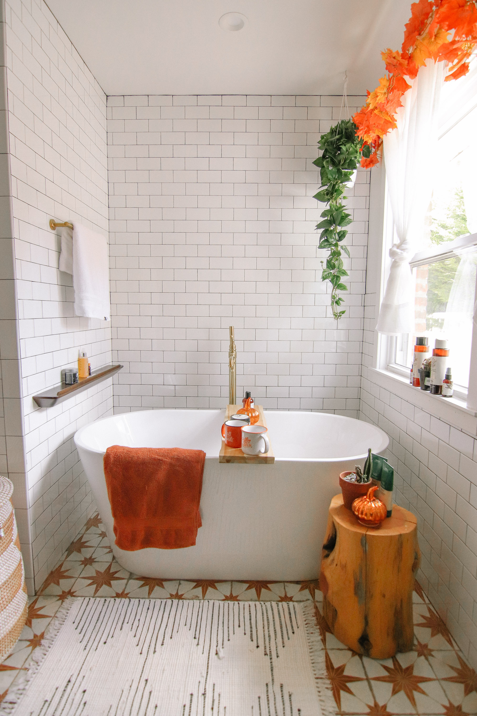
I am SO SO excited to FINALLY share my Master Bathroom Reveal, after so many months of planning it, and watching it come to life! Below is a before photo of the space, which was our kitchen before we renovated our home! When we renovated, we completed changed the location of both the kitchen and the Master Bathroom, which was originally tiny and included only a stall shower and a toilet. My number one priority in the renovation was fitting a soaker tub into our bathroom. I am such a bath person, and i love to bathe every night, read a book, light some candles and unwind. So, this is my DREAM bathroom and to this day I cannot believe it is ours. Matt says we’re living boujee lol!
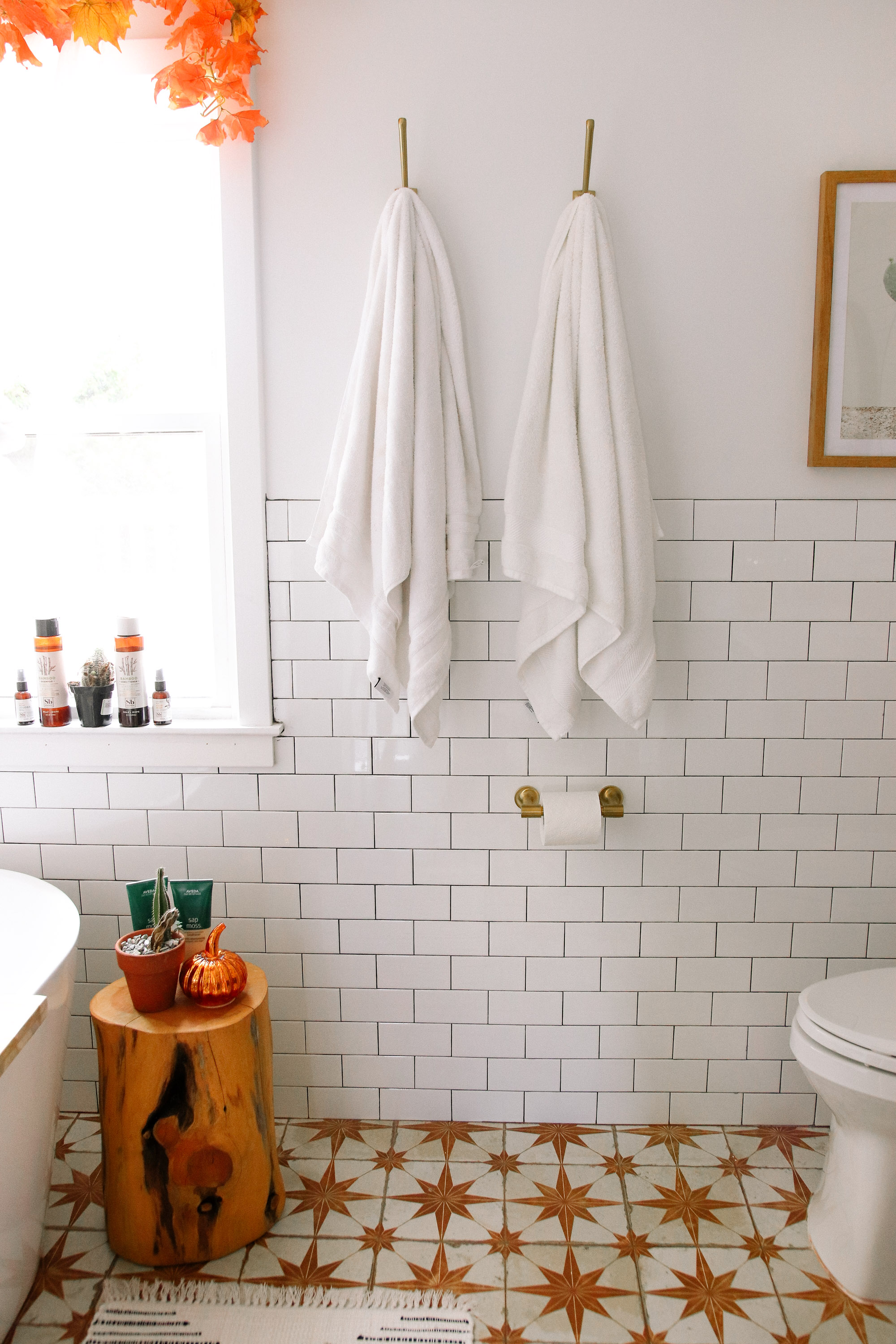
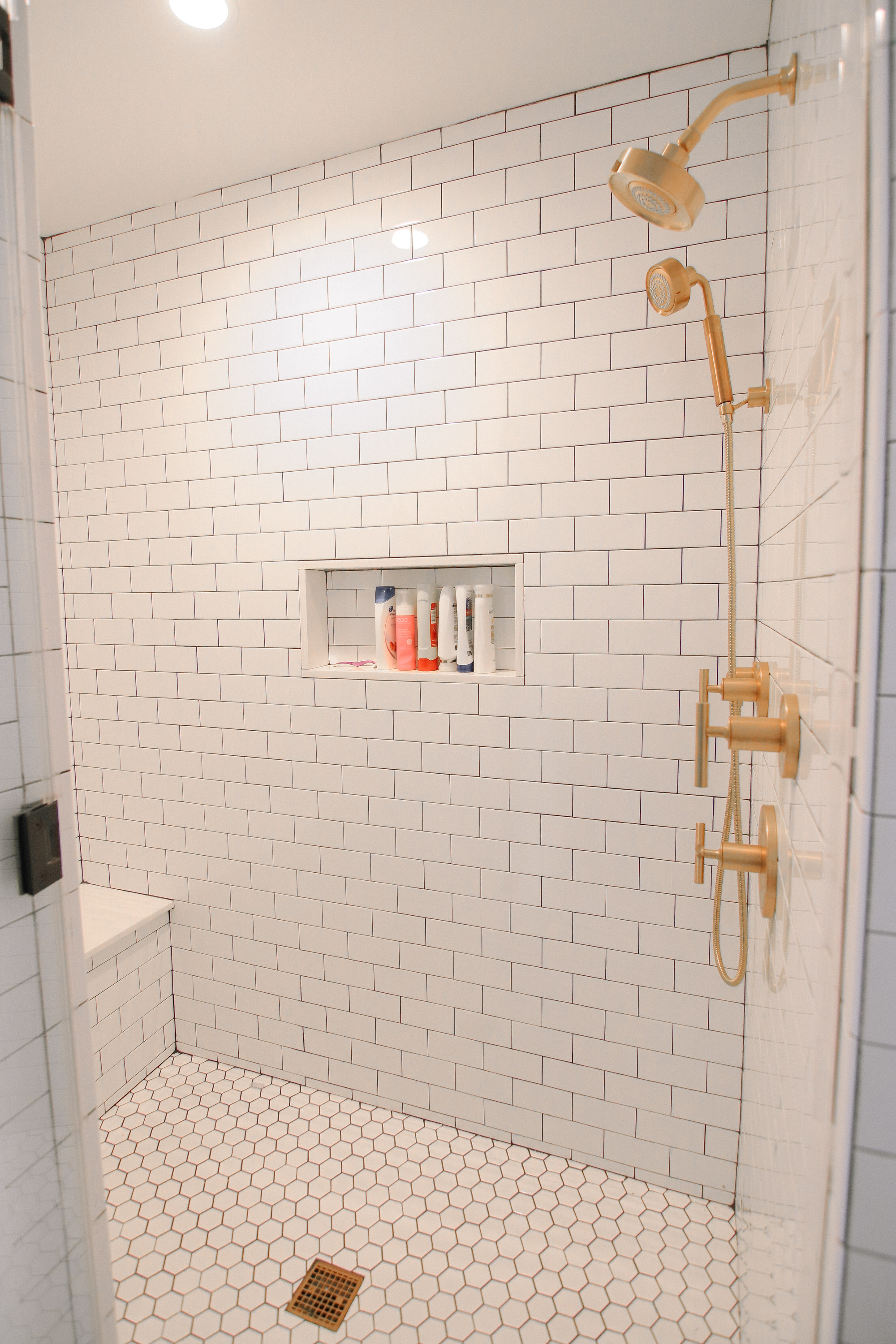
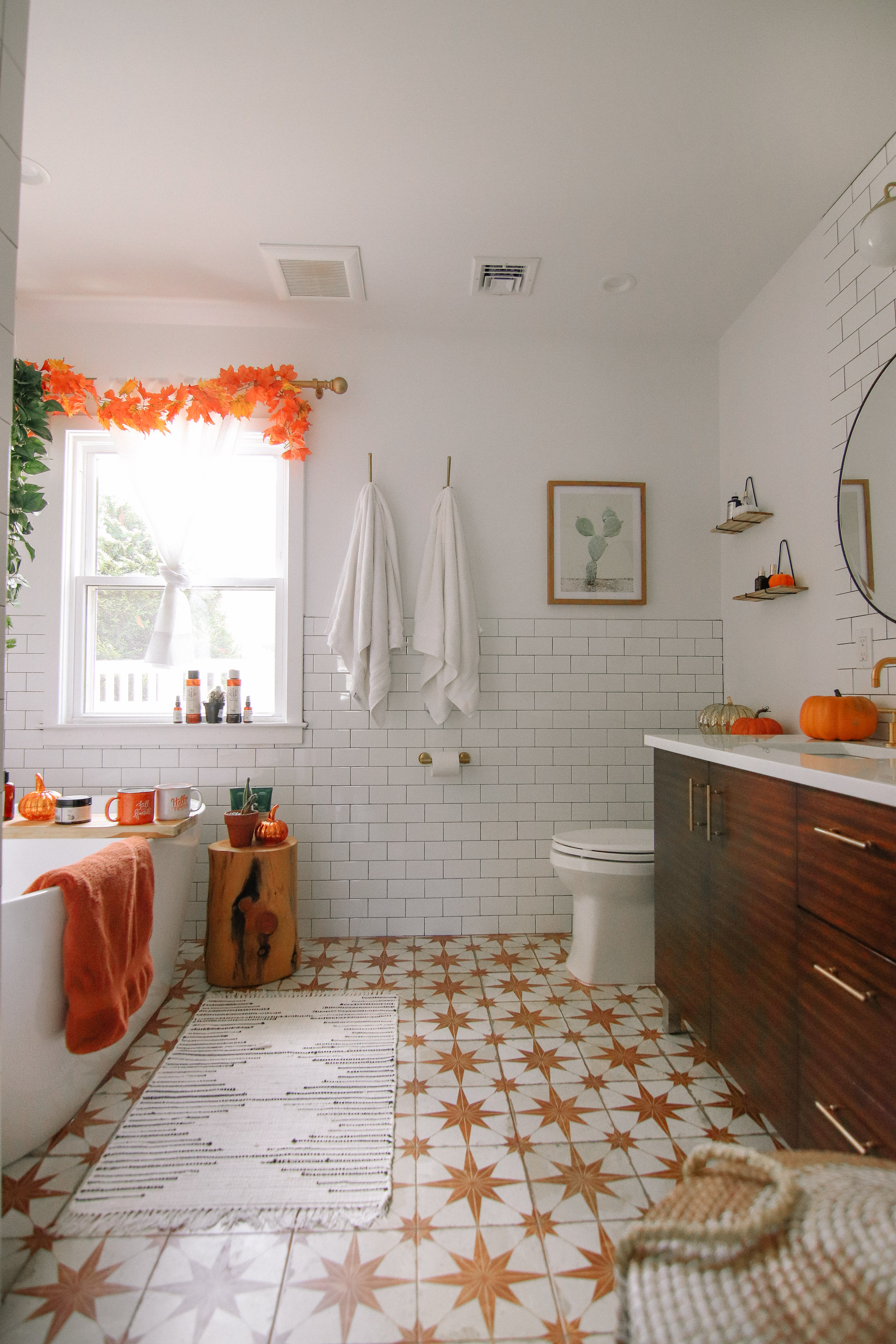
The first huge decision in this bathroom was which tile to use. I really love the look of a white hexagon paired with a white subway tile, but I felt it was too commonplace. When I found this star tile on Wayfair, I thought it was it but I wasn’t 100% sure just because it’s so bold. I sat on the decision for a few weeks, and finally decided to go with it! The brown tile we used comes in and out of stock, but I linked it because its available at the moment! One thing about the tile – the grout color is SUPER specific, it’s an orang-y color. I ended up having to order the grout custom from a local tile store, which added a few extra days to the job. For the wall tile, I used basic subway tile, but I went with a black grout to really pop the pattern out. It’s wild how grout makes such a huge difference! In the shower we needed to use smaller tiles, so I went with this white hexagon.
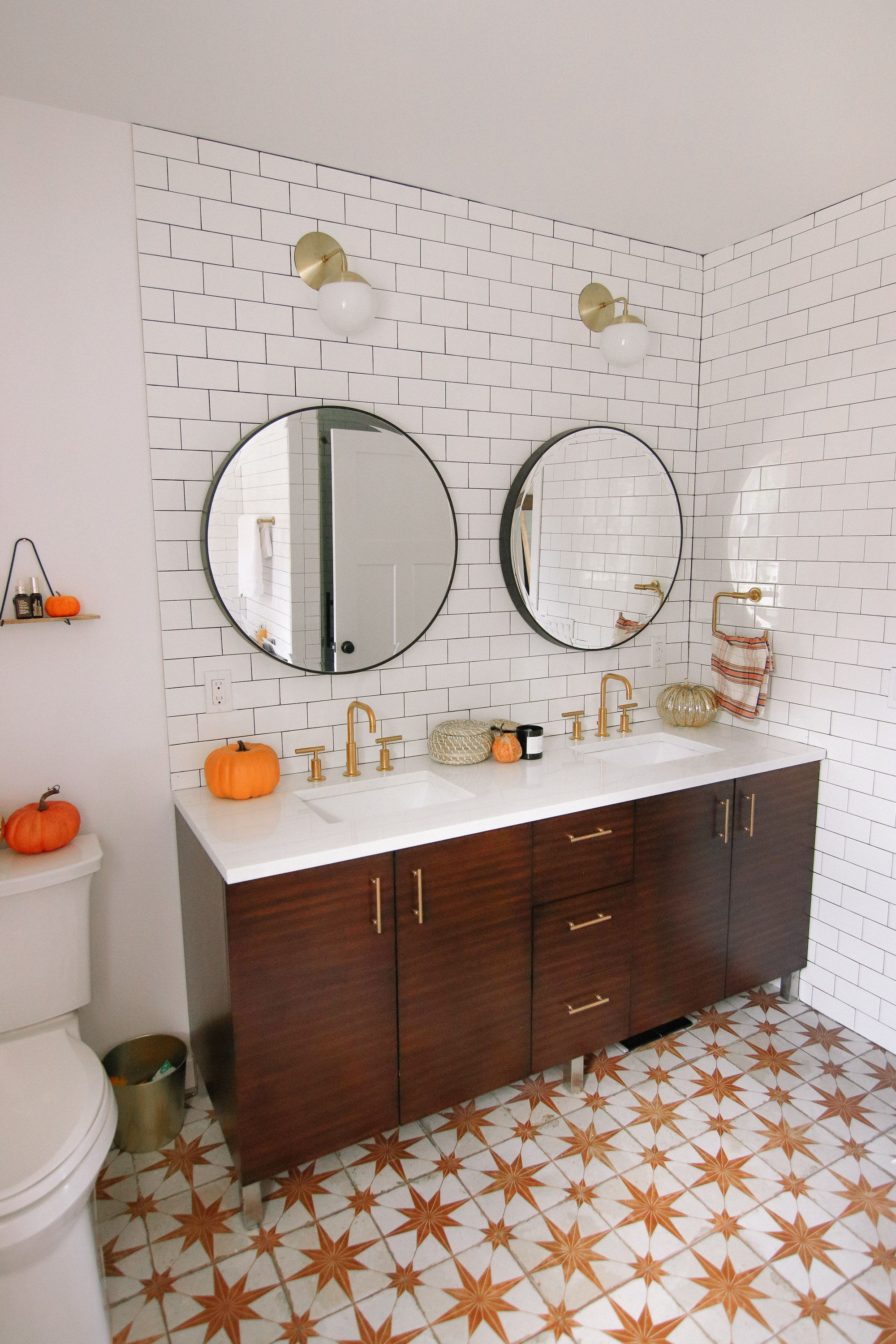
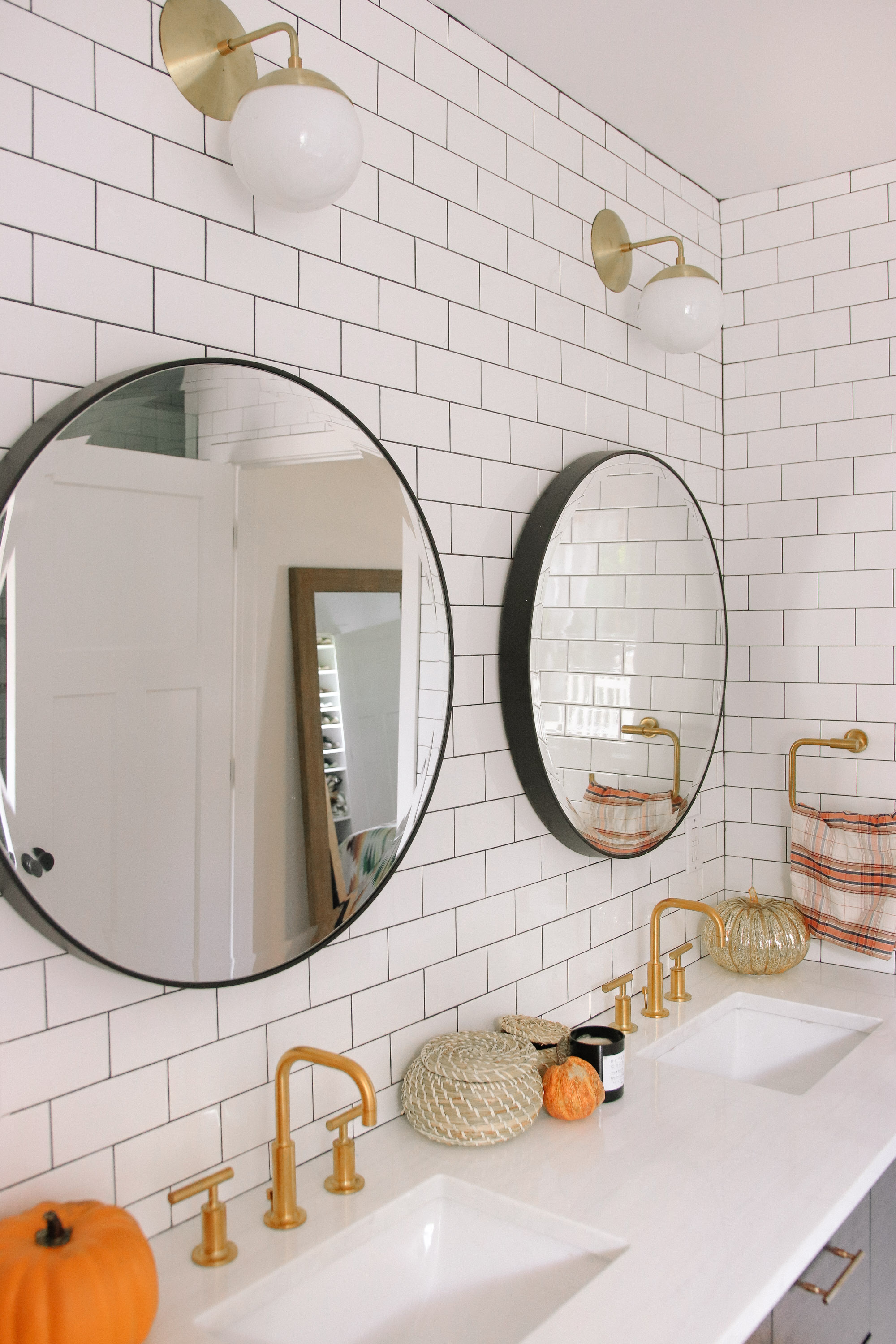
Once we picked the tile, we were torn between using a classic white vanity, or one that is a rich brown color. I ended up loving the vanity we picked, which is a rich wood color. It’s sold out, but I also love this similar one! We really wanted to say goodbye to the idea of needing a medicine cabinet, and I love the look of double round mirrors. These fit perfectly in the space! I originally wanted to do 3 sconces – one in between the mirrors, and one on either side, but because the vanity is up against the wall on the right side I had to improvise at the last minute. I love how these fixtures look above the mirrors! It’s really wild how many small decisions go into completing a bathroom. There were so many details along the way, but I am so so relieved it’s done and I could not love it anymore! Enjoy the photos!
SHOP THE POST:
Before:
*Thanks to Wayfair for partnering on this post, as always all opinions are my own!